Tour
What Teksilo actually ships at version 0.8.0: the widget catalog, the rich-text foundation, the data views, docking, accessibility, theming, internationalization and the tooling, along with the parts that are prototype, opt-in or unverified.
Teksilo is a pure-Rust GUI framework for desktop applications. Accessibility, internationalization, rich text, themes, persistent settings, drag-and-drop, charts and a scene canvas all ship in the framework itself. Underneath, it is a retained widget tree with SwiftUI-style layout, AccessKit accessibility and a wgpu renderer.
This page describes the framework as it stands at version 0.8.0. Where something is a prototype, off by default, or unverified on a platform, it says so in place, and the news page says what moved between releases.
Two API surfaces, one semantics
Every widget is built through a fluent builder API. On top of that sits an optional teksu! block macro for a declarative, SwiftUI-shaped syntax. The macro desugars one-to-one to builder calls at expansion time, with no runtime and no virtual tree, so both spellings can appear in the same file and mean the same thing.
The Widget trait itself has one required method, layout_response. Everything else is optional: build() composes children, paint() draws chrome, accessibility() declares the role and name. A single widget can do all three. Most of the catalog is pure composition of primitives (RectWidget, TextWidget, HStack, Padding); cards, panels and overlays layer paint on top of what they composed.
The catalog
Over 100 widgets ship, plus layout primitives: buttons, lists, tables, trees, tabs, menus, dialogs, popovers, file, color and date pickers, a calendar, charts, a wizard, a breadcrumb, a masonry layout, a split button, a custom title bar and a rich text editor. The generated widget catalog on docs.teksilo.rs covers 135 modules, one page per module, extracted from the source rather than written by hand.
The widget-catalog example is the browsable version: 21 tabs (palette, layout, visuals, containers, chrome, buttons, styling, inputs, indicators, charts, scene, text, rich text, date and time, color, menus, overlays, data, drag and drop, animations, settings). It enables the three optional theme presets and launches into any of the four in light or dark via --theme, so you can see the same tree rendered eight ways. It shows most of the catalog; the rest have dedicated examples. The repository ships 54 runnable examples in all.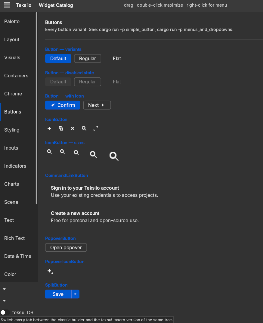
Every screenshot on this page is that example or one of its siblings, captured from the current build.
Text is the foundation, not a widget
The rich-text stack is underneath everything, not bolted on. The document model (tables, lists, undo/redo) and the typesetting engine (shaping, bidirectional text, color emoji, zoom without reflow) are two sibling MPL-2.0 crates already at v1.x and required dependencies: text-document 1.10.2 and text-typeset 1.9.0. Even the plain TextWidget routes through them, so every label gets correct shaping and font fallback rather than a fast path that degrades on the first non-Latin string.
RichTextEditor is the full surface on top: formatting toggles, undo and redo, block splitting, table-aware select-all escalation (cell, then table, then document), a clipboard that writes both HTML and plain payloads, paste unformatted, and a built-in context menu. One TextDocument can drive several views at once, so an editable pane and a read-only pane can share a document with edits propagating live. The document also holds any number of highlight sessions simultaneously, so syntax, spelling and find layers coexist, and each view chooses which of them to show.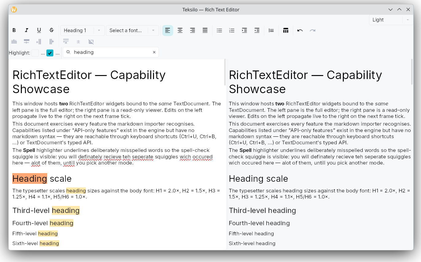
What ships is the highlight mechanism, not the content. There is no dictionary, no grammar checker and no language server feeding them: the highlighters in the rich-text example are demo code with a hardcoded keyword list, and CodeEditor takes its highlighter and completion as injected, language-agnostic hooks that your application supplies.
Data views
ListModel<T> and TreeModel<T> are generic over your own domain type and drive ListView, TreeView, GridView, TableView, TreeTableView, Repeater and TabBar<T> directly. There is no variant type and no role integer: a delegate receives &T. Sort and filter projections, per-view tree expand state, shared selection, drag-and-drop reorder and descendant-to-ancestor tri-state checkbox aggregation are built in.
TableView is multi-column and virtualized: sort and filter, drag to resize and drag to reorder columns, pinned leading and trailing columns, cell-level and row-level selection, edit hooks, row drag-drop reorder, and a full Role::Table accessibility tree. Row heights can be uniform, exact per row, or auto-measured, which is what produces the ragged rows below: the Notes column wraps to one, two or three lines and each row takes the height it needs.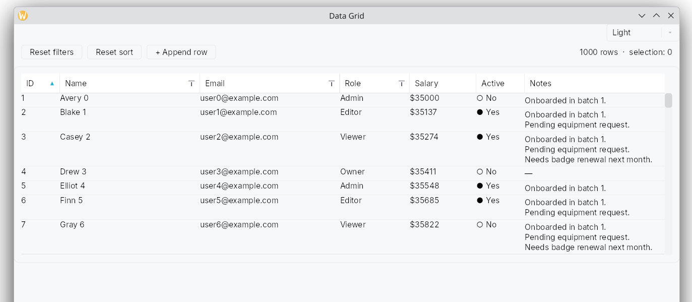
GridView is a virtualized two-dimensional tile grid with three pluggable layout strategies: a uniform grid, a variable-row grid, and a masonry waterfall. It has rubber-band marquee selection, full 2D keyboard navigation, sections with sticky headers, and Role::Grid over Role::GridCell accessibility.
Rows dragged out of any of the five data views carry a public generic payload, RowDragData<T>, and can be dropped on a drop target, a drop zone, another data view, or the OS, with no serialization step in between.
Docking
DockingLayout is a fixed center slot plus four collapsible, splittable, draggable side regions, with per-corner ownership, an activity rail, a five-zone drag-to-dock overlay, and a cloneable serializable model with export_state and import_state.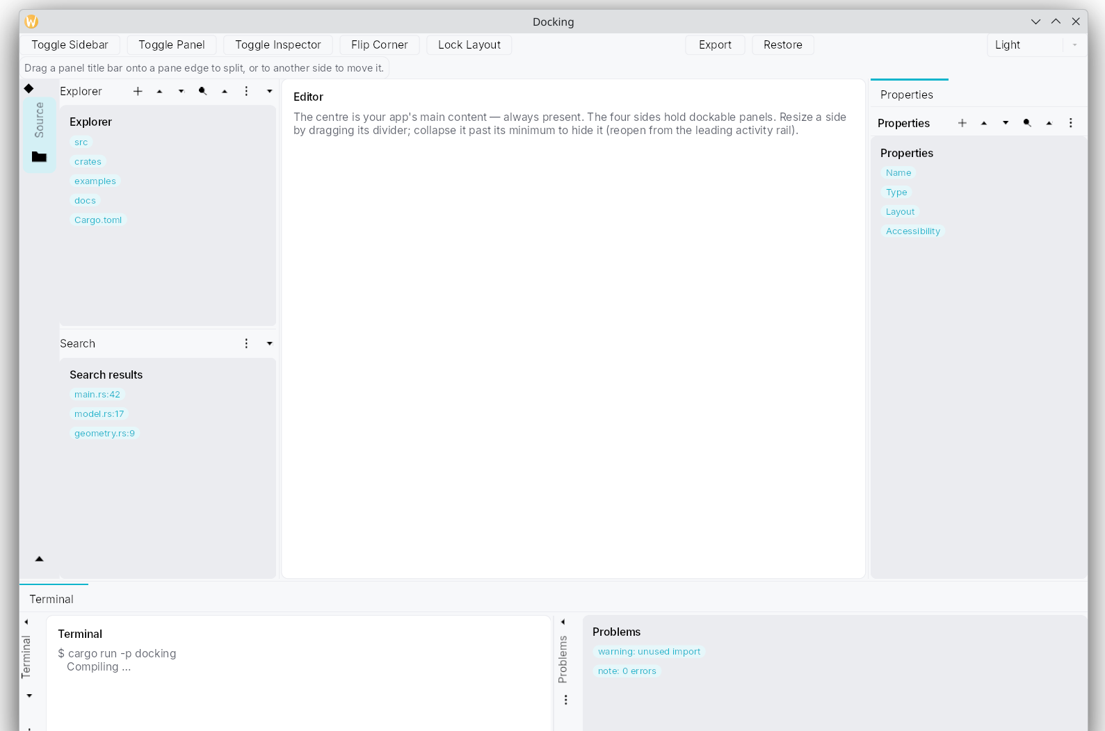
The v1 scope is deliberately bounded, and the limits matter before you design around it. There are no floating or tear-off docks, no cross-window dock moves, no recursive split nesting, no maximize-a-dock and no hover-flyout auto-hide. A structural change (open, close, move, split) rebuilds a panel’s content from its factory, so scroll position and unsaved edits survive resize, show-hide and tab switching, but not a structural move.
Scene canvas
teksilo-scene is a pannable, zoomable viewport for content that is not a grid: corkboards, mind maps, node-graph editors, timelines, simple maps. It mixes two tiers under one view transform. Heavyweight nodes are ordinary Widgets, so focus, animation, drag-and-drop and the accessibility tree all survive being embedded. Lightweight SceneItems are paint-only, with no arena overhead, so thousands of them stay cheap. Both tiers are accessible: lightweight items get synthetic accessibility nodes with screen-projected bounds. One scene model can drive several view panes at once, each building its own widget instances through a per-view delegate, which is how an overview pane and a detail pane share a document.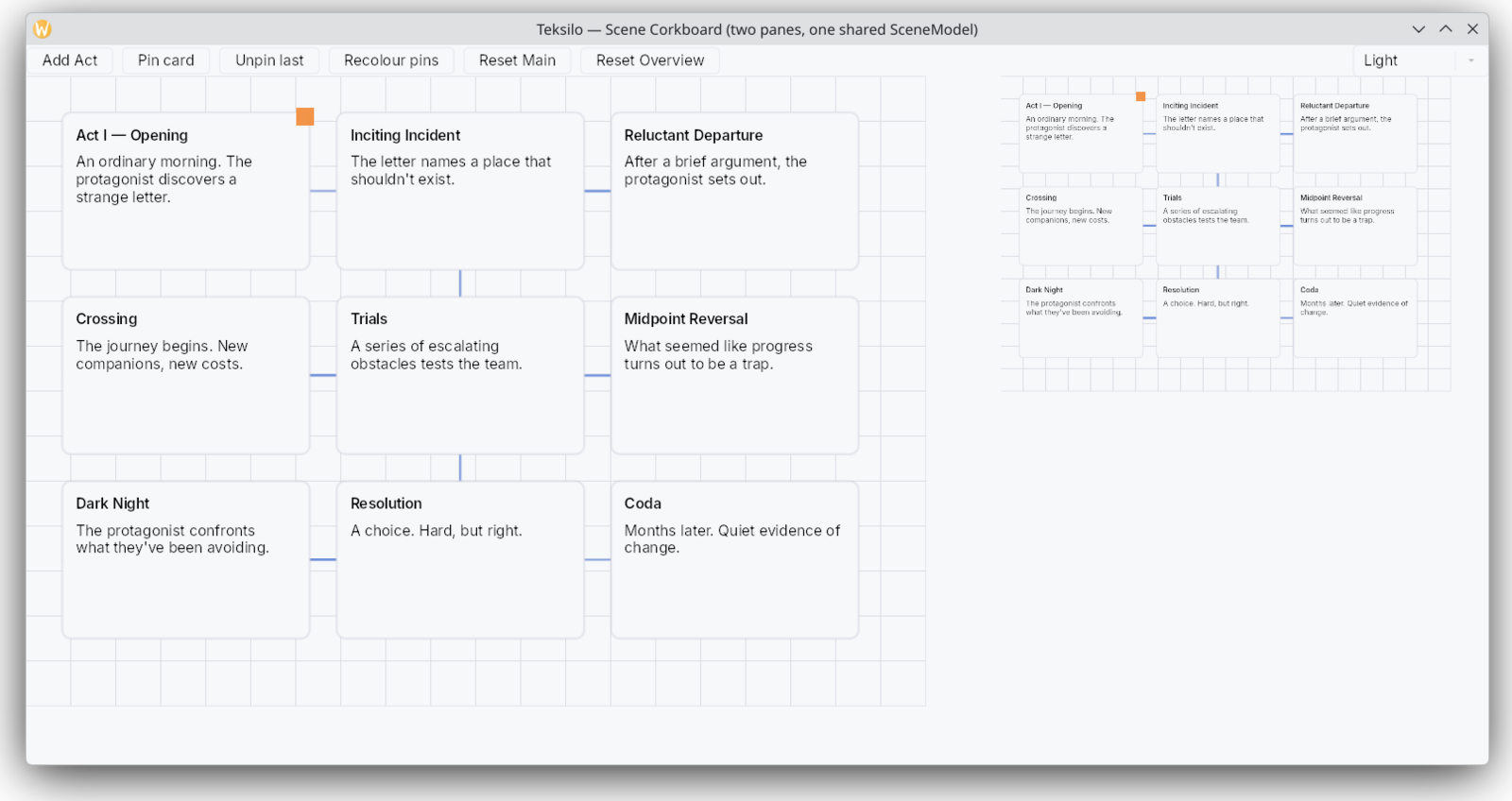
Accessibility
This is the part of the framework with the most design behind it, and it has its own page because a toolkit’s accessibility claims deserve more scrutiny than a tour can give them. The short version is that it is not a layer.
Widget::accessibility(&self, builder: &mut AccessNodeBuilder) sits beside layout_response and paint in the same trait. The assistive-technology tree is built alongside the widget tree rather than reconstructed from it afterwards, and every window gets a real AccessKit bridge from a single constructor: AT-SPI over D-Bus on Linux, identical on X11 and Wayland, NSAccessibility on macOS, UI Automation on Windows. Nothing is stubbed on any of the three.
Layout scaffolding does not reach the screen reader. The tree walker collapses semantically empty containers and promotes their children, so a Button wrapping a Padding wrapping a Center wrapping an HStack wrapping a label announces as one Role::Button leaf. No annotation is needed to get that.
When the default is wrong, .access_label, .access_description, .access_role, .access_live, .access_action and the rest override it from the outside, in the shape of SwiftUI’s .accessibility* modifiers, and .access_customize(|b| ...) runs last with the full builder as the escape hatch. Labels, descriptions and values bind at BindingLevel::AccessibilityOnly, so a tr!() string updates what is announced without a rebuild, and .access_shortcut_id("app.save") announces the chord the user has actually bound rather than the one that shipped.
Three things follow the operating system rather than waiting for you to wire them: an opt-in high-contrast palette applied as a repaint-only color projection whenever the system asks for increased contrast, a text scale from 80 % to 200 % that reaches editable text through the shaper rather than only the theme, and reduced motion, which the animation-owning wrappers honour by snapping instead of tweening.
Contrast is asserted, not asserted-about. A test computes the real WCAG relative-luminance formula over both default themes and fails the build if text on accent, secondary text or the focus indicator drops below its minimum, on every CI run, on all three platforms.
Two limits, stated here rather than only on the deep page. Widget::accessibility has an empty default body: the trait supplies the slot, it does not make you fill it, so a custom widget of yours that skips it emits nothing and nothing will tell you. And a conformance claim is an application-level artifact. The framework can supply correct primitives and stay out of the way; it cannot sign an ACR, a VPAT or a déclaration de conformité on your behalf.
Theming
Switching themes is instant and preserves interaction state. set_theme updates a signal and marks the tree for relayout and repaint without rebuilding widgets, so focus, scroll offsets and selection all survive the switch.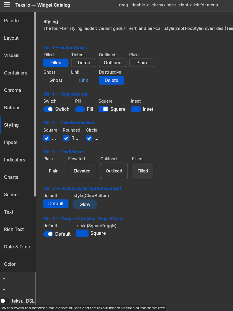
Customization is a four-tier ladder: tokens, then per-widget variants, then paint recipes, then style protocols. The escape hatch at the top is a trait per themable widget; there are 41 such traits and 41 matching theme-wide slots, with 39 default recipe implementations shipping in teksilo-widgets. You can override a single color, one widget’s chrome for one call site, or that widget’s chrome everywhere the theme is active.
Three complete sibling design languages ship beyond the default Int UI-inspired preset: Material 3, Fluent, and macOS Aqua, each with its own tokens and its own widget chrome. All three are opt-in Cargo features (theme-material3, theme-fluent, theme-macos) and are not in the default build, so reaching for one without enabling its feature is a compile error rather than a fallback.
On Linux an app that selects the native theme mode gets a palette that follows the desktop environment: accent, surface, selection and tooltip colors are read from GNOME, KDE and Cinnamon. The default is a fixed theme, not the desktop’s. On macOS and Windows the same mode returns light or dark only, with no color reading.
The default light and dark themes are held to the WCAG 2.1 AA contrast minimums by a unit test that fails the build if either preset regresses below 4.5:1 for text or 3.0:1 for the focus ring. An opt-in high-contrast variant targets 7:1 and tracks the OS “increase contrast” setting, re-querying on window focus.
Internationalization
Translations are checked when you compile. The tr! macro reads the Fluent .ftl files at proc-macro expansion time and rejects a missing key, a missing argument or an unknown argument as a build error, so a typo in a message name fails the build instead of shipping.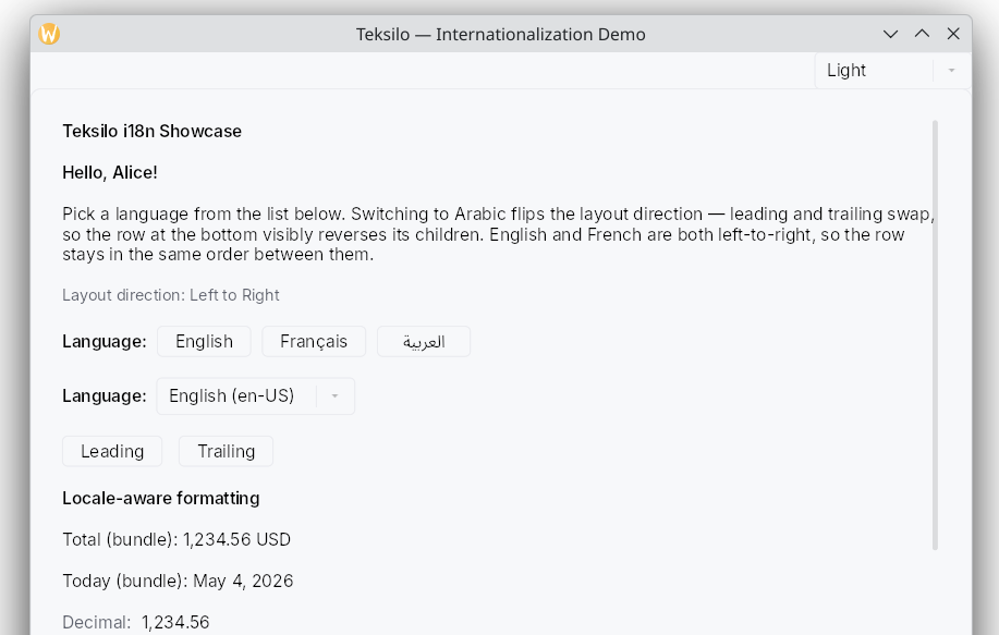
Right-to-left layout is built in: switching to a right-to-left locale flips the direction so leading and trailing swap, and rows reverse their children. Number and date formatting is ICU4X-backed and works both inside translated messages (via NUMBER() and DATETIME()) and standalone through formatters that turn a signal into a formatted signal. One caveat: decimal formatting is fully ICU-correct, but percent currently appends an ASCII % and currency appends the ISO 4217 code as a suffix, with no symbol substitution or per-locale positioning, pending stabilization upstream.
Drag and drop
Within an app: typed payloads, drop indicators, edge auto-scroll. Across applications: inbound OS drops and outbound app-to-OS export, in both directions.
All four backends are implemented in both directions: NSDragging on macOS, wl_data_device and wl_data_source on Wayland, OLE IDropTarget and DoDragDrop on Windows, and XDND on X11. macOS, Wayland and Windows have had live verification. X11 is covered by protocol tests and has been run against KWin via XWayland and against Openbox in CI, but not against a standalone Xorg server.
Two limits apply everywhere. An OS-exported drag advertises Copy only, never Move, so a data view marked exportable-as-Move behaves as a copy the moment the drag crosses a window boundary, and the source is never told to delete. And X11 has no drag image, because XDND carries none in the wire protocol; the cursor changes instead.
Idle discipline
An idle Teksilo app draws zero frames. The framework treats a 60 Hz idle pump as a defect rather than an acceptable cost, and the animation subsystems are gated on whether their owning widget is actually visible, so an animation parked in a hidden branch contributes no frames at all.
Testing
The same widget tree runs under tests with no window, no GPU and no winit, and CI runs a plain cargo test --workspace with no display server. Tests target behavior (event dispatch, layout output, accessibility-tree structure) rather than implementation snapshots, and a simulated clock (advance_time) makes time-dependent behavior deterministic instead of flaky.
The suite is 6,000+ tests in Teksilo and 8,000+ across the whole stack.
Tooling
Three things ship with the framework rather than being sold alongside it.
The inspector. F12 in a debug build opens a panel across the bottom of the window with nine tabs: tree, properties, accessibility, theme, locale, focus, shortcuts, overlays and data models. The tree tab filters and scrolls to a match; the properties tab copies a value; the accessibility tab shows the node a screen reader would see, which is the fastest way to find out that your custom widget is announcing nothing. There is a picker for clicking a widget to select it, a bounds overlay with padding and stack-gap bands, and Flutter-style yellow and black hazard stripes wherever a container’s children spill past it, so an over-constrained layout is visible rather than merely wrong. The whole crate is cfg(debug_assertions), and install_inspector_in_debug() compiles to a no-op in release, so the call site needs no #[cfg] and a shipped binary carries none of it.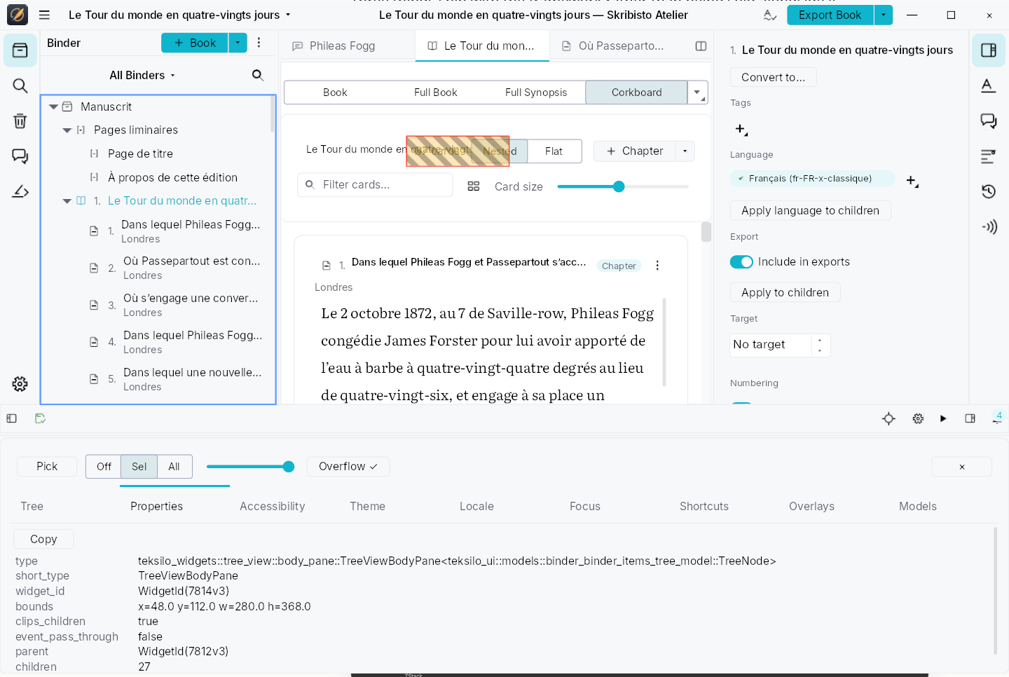
The previewer. A Storybook-style three-pane explorer: navigator, canvas and a generated knob form, with live property editing, multi-variant rendering and PNG export. Widgets register themselves through inventory, so a third-party widget library becomes previewable by adding one submission and without depending on the previewer’s own GUI.
The automation bridge. A Model Context Protocol server lets an agent read the live accessibility tree and drive the application through accessibility actions and synthetic input, in-process, with no operating-system accessibility layer involved. It reuses the tree every widget already declares, which means it is also a way to find out whether that tree is any good. The socket bridge is debug-only and Linux and macOS only; there is no surface in a release build.
What is off by default
Several headline capabilities are opt-in Cargo features, not part of the default build:
- Theme presets.
theme-material3,theme-fluent,theme-macos. Int UI is the only always-available preset. - Web view.
web-view, and a prototype besides. The wry backend (WKWebView, WebView2, WebKitGTK) is functional; the Servo backend for native Wayland constructs a real engine but is not frame-driven yet, so it paints no page. - Terminal.
terminal. A PTY-backed console widget that renders into the wgpu surface. - Async. The main-thread executor and its Tokio and async-std reactors. The core stays synchronous and pays nothing when it is off.
- Telemetry. Opt-in, with compile-time-validated event schemas.
- Agent automation. The MCP bridge, which is additionally gated on
debug_assertionsand has no surface in a release build.
Known gaps
The README keeps a gaps list:
- CJK IME composition. Latin and bidirectional input compose correctly; Chinese, Japanese and Korean input methods need to be tested by actual users.
- X11 verification breadth. Live verification has been done against KWin via XWayland and, in CI, Openbox. Other window managers are untested and there is no run against a standalone Xorg server. A window manager without
_NET_WM_MOVERESIZEis detected up front and keeps native decorations rather than producing an immovable window. - Mobile and web. Linux, Windows and macOS are the primary targets. There are no mobile or web targets.
- API stability. Pre-1.0; breaking changes are expected between minor versions.
Production deployment is currently limited to FernTech’s own applications, and the 0.x label reflects that scope. Roadmap priorities are weighted by what those applications need.
The application driving it is Skribisto 3, a writing application for long-form work, which is written on Teksilo end to end and ships at the same time as the framework. That is the sense in which any of this is proven: one real application, of a size that exercises the rich-text stack, the data views, the docking layout and the accessibility tree at once, rather than a set of demos. It is also why the roadmap leans where it does, and why a widget Skribisto does not need may be thinner than one it does.
Where to go next
Get started is the shortest path to something running. Accessibility is the long version of what the trait-level accessibility model does and where it falls short. Documentation explains how the guides and the API reference fit together. License and trademark covers the MPL-2.0 terms and the naming rules for forks.